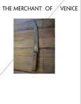
Merchant of Venice 2 POSTER Merchant of Venice cover 2 Merchant of Venice back
Project Narrative
Project Narrative:
The Merchant of Venice is a play wrought with issues of morality, justice, and hidden motifs. The film directed by Al Pacino is set in 16th century Venice, which is also the time period of William Shakespeare’s original play. The plot begins when a merchant (Bassanio) must borrow money from a friend and lender (Shylock) via his friend and businessman Antonio, before knowing that the money will be used to sue for a woman’s hand in marriage. In order to get the money, Antonio must go to Shylock, a Jewish moneylender.
Our group’s version of The Merchant of Venice is set in New York in the 1920s; hence, the reason why Ashley and I chose to manipulate a photo from this era. We began with a different photo initially, but feedback from our first critique allowed us to see that a different photo would better convey the play’s mood. The director’s note described Shylock as a “high-ranking member of the mafia,” which Ashley and I sought to capture by tracing an image of a well-dressed man in the 1920s alongside an outline of a woman from the same time period. The woman clutching the man’s arm symbolizes both of the women in this play, but specifically Portia. Women are used as pawns in this play, especially to identify one of the major moral codes, which is choice.
For the background photograph, we used Photoshop’s hue and saturation effects, giving the photo a varied brightness and contrast to the figures in the foreground. The juxtaposition of an illustration in front and an antiquated photo behind it combines a modern approach with a traditional one, which was the message Ashley and I received from our directors.
With our design for this poster project, we wanted to avoid the tendency to over-illustrate or use elements where they’re not appropriate, which can be a challenge. We also didn’t want the poster to feel like an advertisement for a movie. The Merchant of Venice is a play with a complicated plot, and by using layers for our poster, we aimed to convey the idea of a play with a lot of underlying problems and moral issues, even if they are not immediately apparent to the viewer at first glance — or in this case, first read.
3 Illustration Iterations
I want to talk more in-depth with Ashley in class about iterating three design options, but I know we’re leaning toward using the following in each initial poster illustration:
Photography — we want the poster to look old and aged, while still maintaining a “New York mafia” feel
Drawing — after our talk with Sarah Hogan, Ashley sketched several new ideas, one of which was a New York street near a subway, with drops of blood spilling over the street. I’d love to incorporate her drawing skills in at least a little bit, since that’s definitely a strong suit of hers.
Layers — Ashley and I want to effectively use layers in each poster. We don’t want to overcrowd or overwhelm the viewer, but rather give the impression that, upon closer inspection, this play has several moral layers that the viewer must peel back in order to fully understand Shakespeare’s comedy. By using this element on the poster, we’ll be able to better convey each of our ideas as they translate to our group’s performance and version of The Merchant of Venice.


